When homeowners plan a kitchen remodel, they usually focus on cabinets, countertops, and appliances. They completely forget about tile placement, which is the one thing that really affects how big or small their kitchen feels. Get it wrong, and even a well-designed kitchen will feel like a storage closet. The walls close in, the ceiling drops, and every morning you’re reminded that the renovation didn’t fix anything.
At Silver Bo Stone, with 24 years of stone and tile expertise serving Bremerton, Silverdale, and the Pacific Northwest, we can tell you with certainty that the right tile arrangement changes everything.
This blog breaks down exactly how tile layout, pattern, size, and finish work together to visually expand a kitchen. The real difference-makers are in the details, so read it through completely.
Your Kitchen Isn’t Small: It’s Just Designed That Way
The brain doesn’t measure a room in square feet. It reads visual clues like grout lines, how light reflects off of tiles, the direction tiles move, and how surfaces connect. A compact kitchen tiled correctly will feel larger than a bigger kitchen tiled without intention. This is spatial psychology, and it’s why professional designers treat tile placement as a visual tool, not just a surface covering.
If your kitchen feels cramped, the way the tiles are arranged is almost always to blame, even if you can’t put your finger on why right away.
The Power of Tile Layouts
One of the most important but often ignored choices in any kitchen remodel is how the tiles are laid out. Grout line direction literally guides where the eye travels. The room gets bigger when you point it at the wall that is farthest away. If you stop it at random times, the kitchen feels smaller and broken up.
- Horizontal vs. Vertical Orientation
Rectangular tiles laid horizontally draw the eye across the room, widening a narrow kitchen. The same tile laid vertically pushes the eye upward, making low ceilings feel taller. Most installers choose horizontal because it’s what they’re used to, but vertical stacking on backsplash walls can really change the look of a kitchen with an 8-foot ceiling.
- Diagonal Placement
Laying square tiles at a 45-degree angle is one of the most effective visual tricks for small rooms. The longest diagonal line draws the eye, not the short horizontal or vertical lines, and the kitchen looks much bigger. It takes a little more precise cutting, but the spatial benefit is hard to get any other way.
- Continuous Flow Across Zones
One underused tile layout tip for small rooms: run the same tile from the kitchen floor into an adjacent dining or living space. The brain sees every material boundary as a wall. Take away that boundary, and the space will naturally grow.
Tile Patterns That Actually Make Small Kitchens Look Bigger
The best tile patterns for small kitchens share one quality: they create directional movement that leads the eye outward rather than stopping it.
Herringbone is exceptional for kitchens. Herringbone creates a dynamic diagonal rhythm that makes the room feel bigger and more active, unlike a grid, which the brain can easily “count.” It works best on floors and backsplashes with rectangular tiles.
Running bond (brick pattern) is a solid middle ground. More spatial interest than a straight grid, without the complexity of herringbone. When laid horizontally, it makes the room bigger. The key is to keep the grout subtle so that the movement looks like it’s going on all the time.
| Pattern to Avoid | Why It Shrinks the Space |
| Small mosaic tiles across large floors | Too many grout lines create visual clutter |
| Two competing patterns on the floor and backsplash | Visual conflict, the eye can’t settle |
| High-contrast grid on a small floor | Brain “counts” the squares; the room feels measured and tight |
Most kitchen remodels miss this: Two strong patterns on the floor and backsplash at the same time cancel each other out. Use one bold layout and make the other surface less busy.
Tile Size Matters, But Bigger Isn’t Always Better
There’s common advice circulating online: always use big tiles in small kitchens. This is partly true, but it’s also too simple in a way that can lead to real mistakes.
Large-format tiles reduce grout lines, which reduces visual fragmentation and makes surfaces read as more continuous. That part is accurate. But the scale must be proportional to the room. In a small kitchen, a tile that is too big can feel out of place, just like furniture that is too big can make a room feel smaller. For most residential kitchens, a 12″×24″ or 18″×18″ format hits the right balance: it’s large enough to reduce seams and proportional enough to feel intentional.
The Grout Detail Nobody Talks About
Here’s what most homeowners don’t discover until after installation: grout color can completely undo the effect of your tile size. High-contrast grout makes every tile stand out, making a large-format floor look like a grid again, which is exactly what the larger tile was meant to get rid of.
The fix is simple: match the grout color closely to the tile. This creates a continuous surface visual where joints practically disappear, and the floor reads as one uninterrupted plane. This one choice has one of the biggest visual effects in the whole remodel, and it doesn’t cost anything extra.
It’s not about bigger tiles. It’s about smarter placement. The wrong grout color on the right tile is still the wrong choice.
How Light Colors and Finishes Can Instantly Open Up Your Kitchen
Light surfaces reflect more lumens back into the room, which raises perceived brightness and, with it, perceived spaciousness. This isn’t just a matter of taste; it’s physics.
Light-colored tiles in whites, soft creams, pale greys, and warm ivories reflect both natural and artificial light. In a kitchen with even modest windows, this creates an amplifying effect where every surface contributes to a room that feels open and airy.
| Finish | Effect | Best Application |
| Gloss | Reflects light; visually pushes walls outward | Backsplash, feature walls |
| Matte | Soft, grounded feel; hides scuffs | Floors |
| Polished stone | High reflectivity; expansive look | Countertops, full-height wall tile |
One approach that consistently works: gloss tile on the backsplash, matte on the floor. The backsplash bounces light into the room while the floor provides visual stability.
Maintaining tonal continuity between surfaces, like having the backsplash, floor, and countertop all be the same color family, removes visual boundaries between zones and makes the space feel bigger without changing any of its dimensions.
Small Layout Changes That Can Make Your Kitchen Feel Bigger
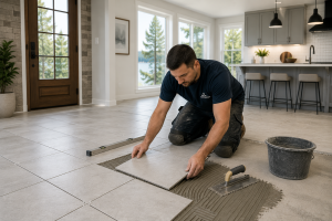
Good tile selection paired with careless installation still produces a disappointing result. These tile layout tips for small rooms are straightforward but consistently overlooked:
- Run floor tiles parallel to the longest wall: To direct the eye along the room’s maximum dimension.
- Extend backsplash tile floor-to-ceiling where possible: A horizontal break mid-wall creates a visual interruption that lowers the ceiling.
- Keep grout joints narrow: 1/16″ to 1/8″ for wall tile. Every extra millimeter of grout is another line the eye has to process.
- Avoid feature walls in competing styles: One dominant design direction reads as confident and spacious. Two competing ones read as busy and small.
None of these adds complexity or cost to a project. But skipping them in a compact kitchen is the kind of oversight that leaves homeowners feeling the remodel didn’t quite deliver what they paid for.
The Right Tile Is the Foundation of a Kitchen That Feels Right
A kitchen that feels small doesn’t just make you uncomfortable every day; it also lowers the value of your home and makes you wonder if you’ll still love the remodel five years from now. The decisions that create the biggest visual difference aren’t necessarily expensive ones. These are design choices: the direction of the pattern, the color of the grout, the finish, and the orientation of the tiles.
Get them right, and the room transforms. Get them wrong, and the renovation money is spent without the result you imagined.
At Silver Bo Stone, our team specializes in exactly this kind of detail work. With a 4,000 sq. ft. showroom in Poulsbo, we serve homeowners across Bremerton, Silverdale, Bainbridge Island, and the surrounding Pacific Northwest. Our design team doesn’t just show you materials; they help you understand what each choice will actually do to your space before you commit.
Stop guessing and start seeing results. Call us at (360) 297-4080 to schedule your design consultation. We’ll walk you through real samples in person and help you build a kitchen that earns every compliment it’s going to get.